


Over the past several weeks, the state of Minnesota has been choosing a design for a new state flag. The state’s intention was to give citizens a design that represented everyone in the state and erase the harmful memories that the old flag held. On Dec. 19, the state made its final decision on a new flag design.
Social studies teacher Scott Miller said he wasn’t excited about the decision to change the design, but after some time he changed his mind in realization of the old flags effect.
“I’m a bit of a traditionalist,” said Miller. “So at first I wasn’t super happy about it, but then I realized that if it was offensive to people, then it’s not the end of the world to change the flag.”
Junior Maximo Dean said he prefers the new design over the last one because of its simplicity and color scheme.
“I like how it’s more simple,” Dean said. “On the old one, I didn’t like how the font looked and the colors, but I liked the new colors and the simpler design.”
Junior Magnus Smith said he thought the state wanted to change the design to create a more empowering identity.
“I believe the change was to give us a different identity,” said Smith. “Minnesota has always been very progressive and up with the times, so when we get ourselves a new flag that kind of looks like we’re giving ourselves our own state power.”
Miller said although he likes the new flag design, he would have preferred one that showed the state bird.
“I liked the loon,” said Miller. “I think there are two things that you have to include, (like) the border of the North Star State. So it’s good that they’re having the North Star, but I think I like to see something with our outdoor heritage, and I think the loon symbolizes that in Minnesota.”
According to Dean, if he could have had the flag done in his vision, he would have loved to see the state bird waving in the wind.
“Honestly, I think they should have added in the state bird,” said Dean. “I would have liked to see the loon on the flag. I think the loon is a really cool symbol.”
Smith said he has mixed feelings about the changing of the state flag.
“I feel weird about it, I’d say. I prefer the old flag just based on all the states around us,” said Smith. “If every state got a new flag, I would feel better about it.”
The new redesign is to be adopted as of May 11.


Tami dobler • Jan 10, 2024 at 2:54 pm
It’s terrible! It looks like a third world flag! Nothing about the state at all! Sad why because one person is butt hurt we have to change everything’s! You don’t like it don’t look my his we Bend over backwards for everyone. So most the people in the state who liked the old flag has to change because of just a few! Waist of time and money! Minnesota good at waisting money that’s why they are broke!
Noah Leventhal • Jan 23, 2024 at 12:54 pm
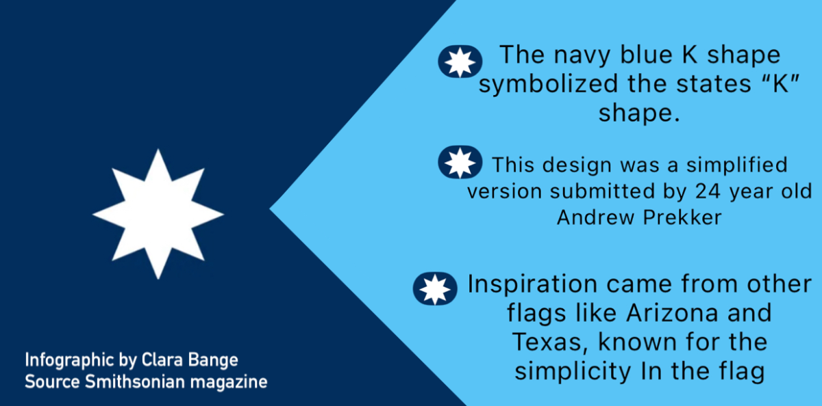
Thanks for your thoughts Tami, but this flag is actually quite superior to the former Minnesota flag. For one, its design works better in the flag model — being more simplistic and minimal, it makes it easier to see from a distance and its more recognizable. The previous flag design, a complicated seal on a blue background, doesn’t lend itself well to be distinct and unique, not representing our state very much at all as all other states around us have the same design. The new flag design has many features that relate to Minnesota as well, making it a good representation of the state; the blue colors for our many lakes, the star resembling the North Star State, and the classic K shape of Minnesota itself. In my opinion, this flag works better to represent our state instead of the basic seal design thats too complicated to read. From what I’ve seen online, people generally enjoy this flag much more for the above reasons, and the people that don’t are usually quite old and nostalgic for the flag they grew up with. I hope I was able to educate you a bit on why this re-design was made, and it wasn’t a waist of my time.